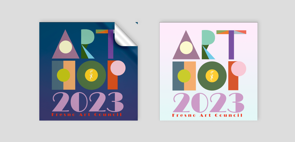
Local Art Hop every year has a competition for the logo re-design and my take on it was an abstracts lettering. I was trying to create a typeface from the different color shapes so it will look like a collage.
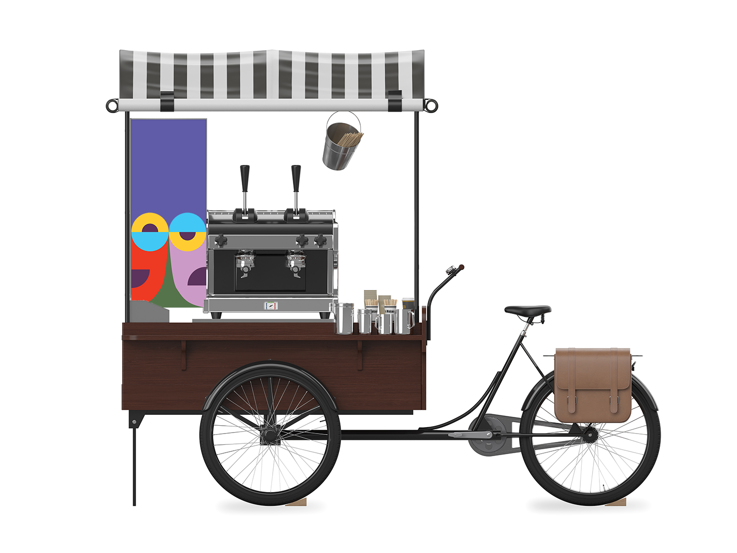
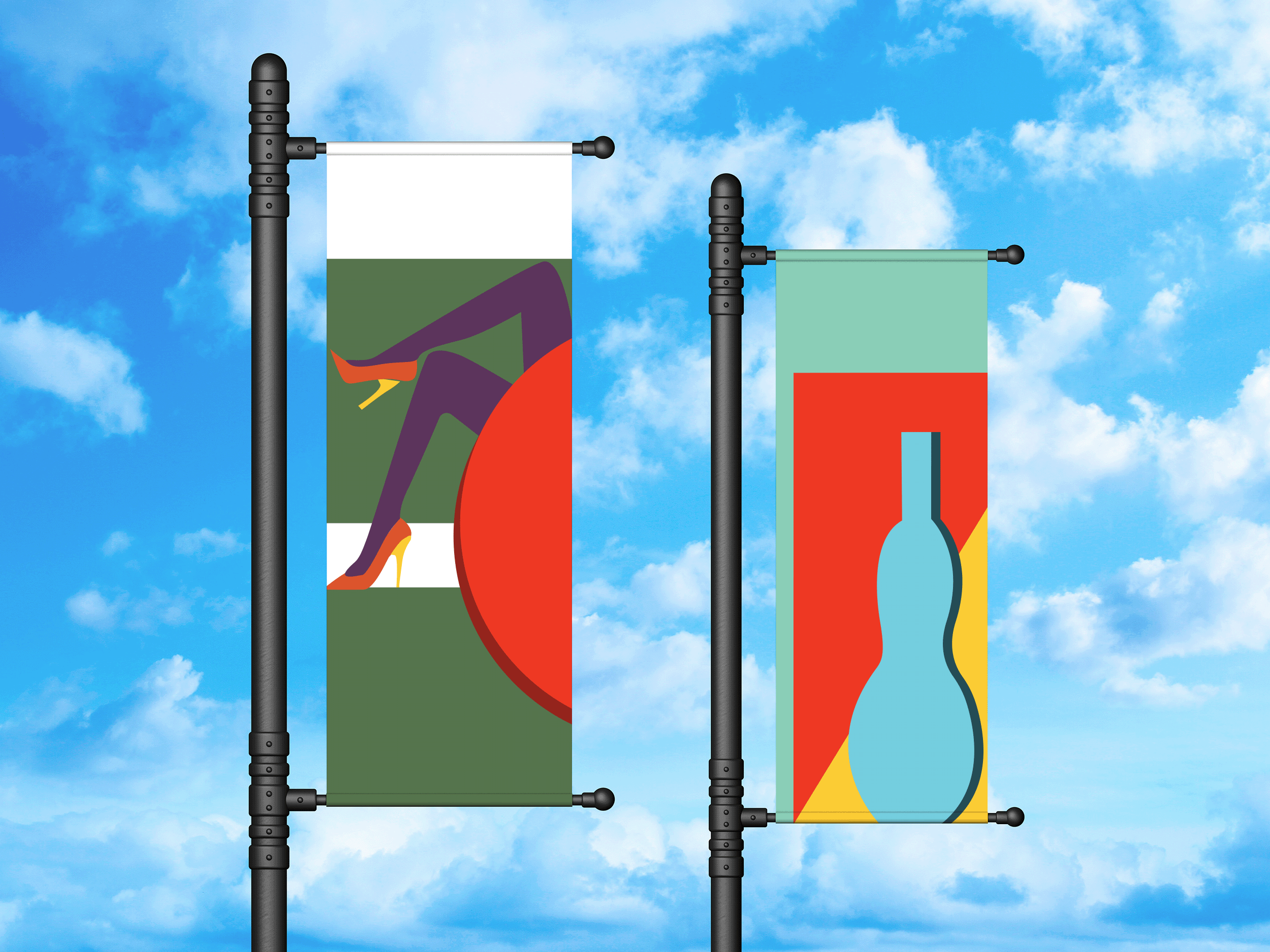
I used the same idea in creating banners and moving cart promotions for the event. That branding suppose to be playful and represent all the arts that are shown at the event.


Leave a comment